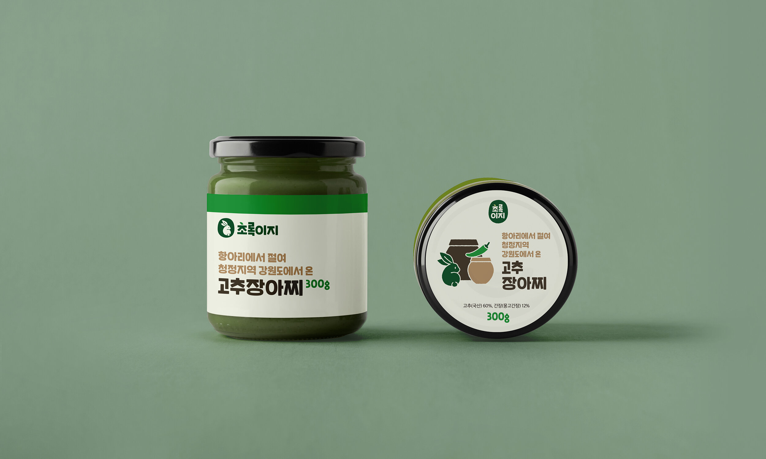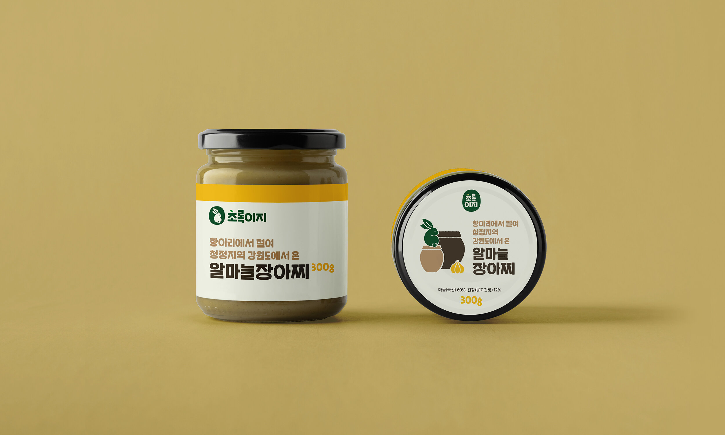
Branding of Greeneasy
Branding of
Greeneasy
Brand Identity, Packaging
Greeneasy l 2020
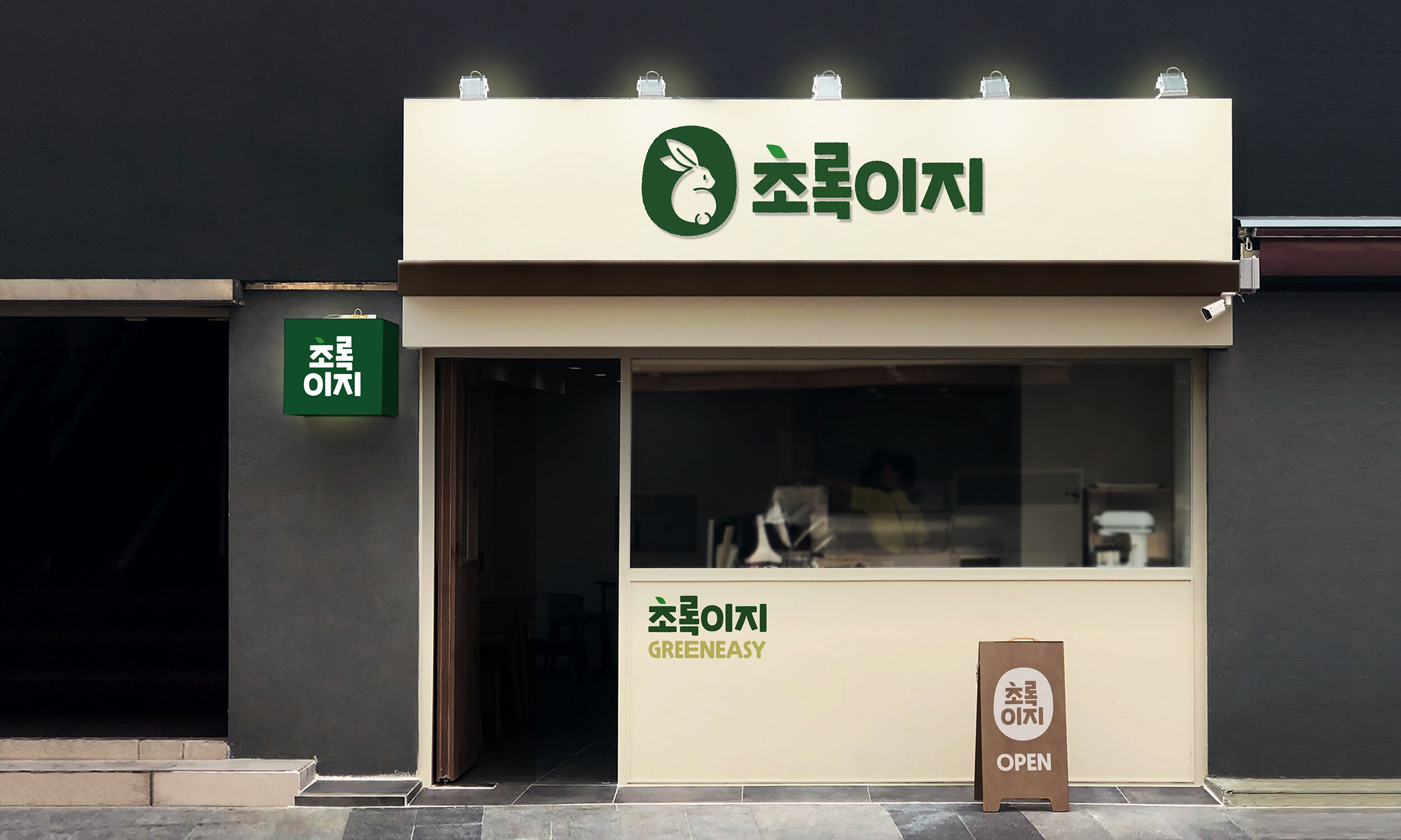
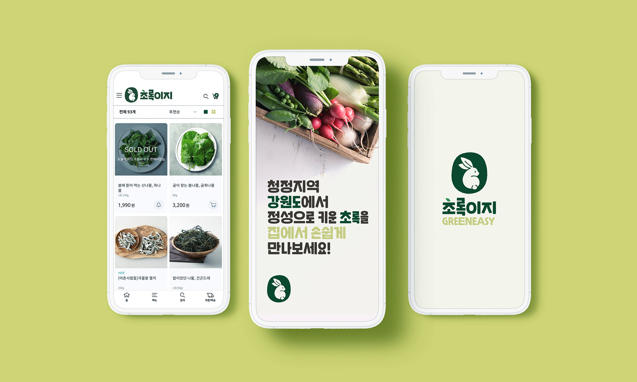
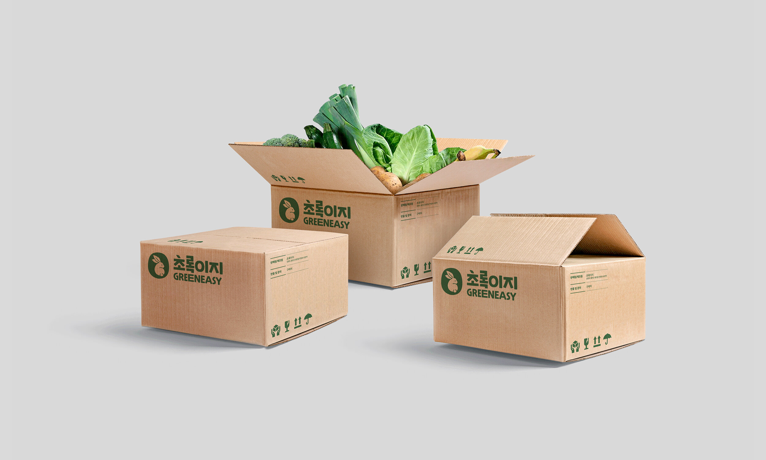
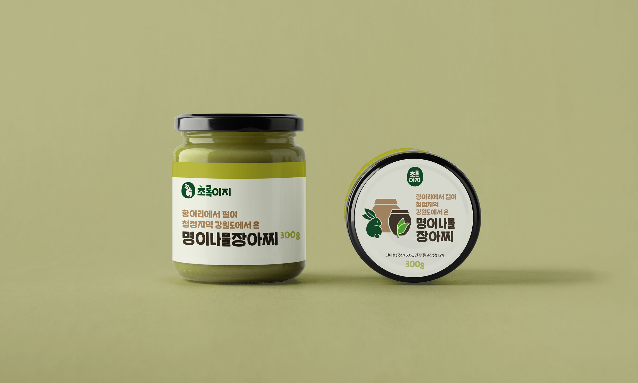
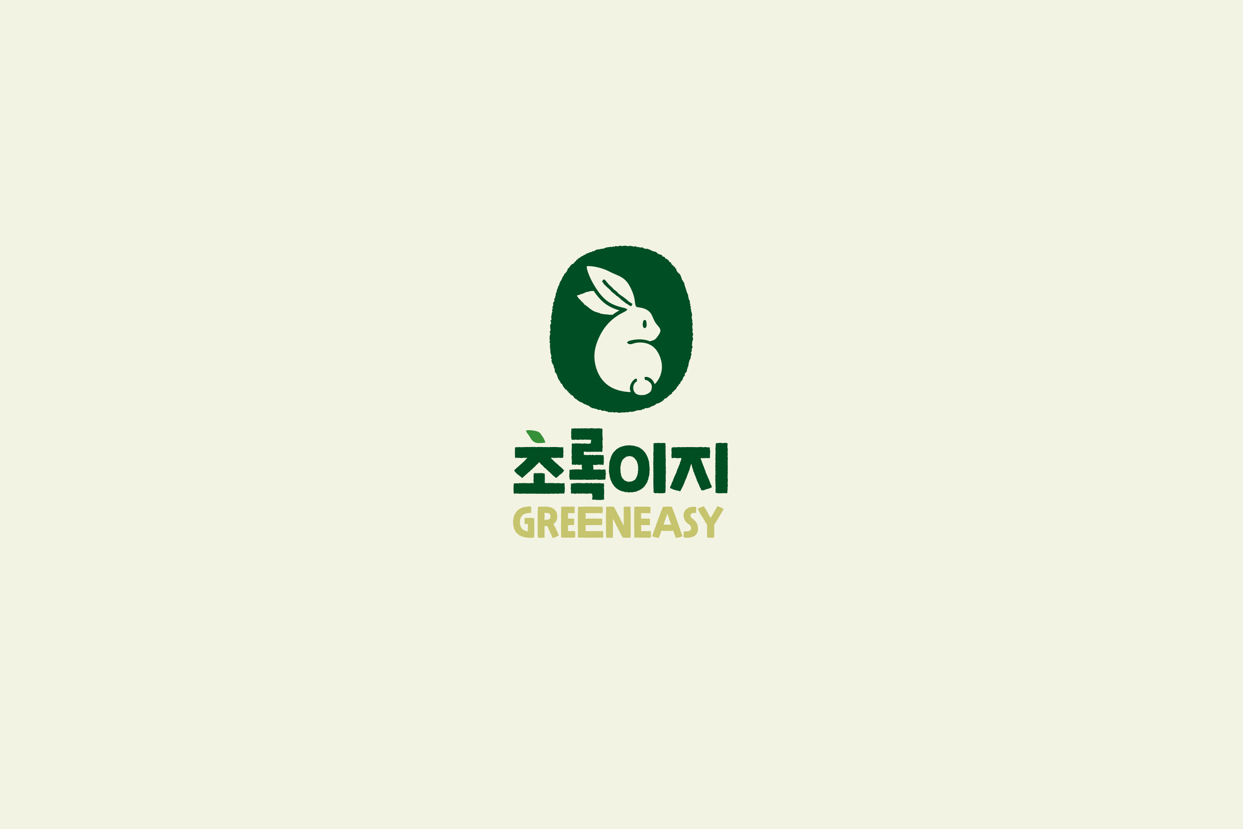
This is a brand identity work for a startup farm and food brand of a young farmer in a rural area. As a healthy food brand, Greeneasy directly cultivates and sells eco-friendly and organic vegetables and pickles. By designing the shape of a rabbit with leaf-shaped ears as a symbol, we expressed the image of fresh agricultural products in the clean area of Gangwon-d0 where Greeneasy is located.
